

About Project
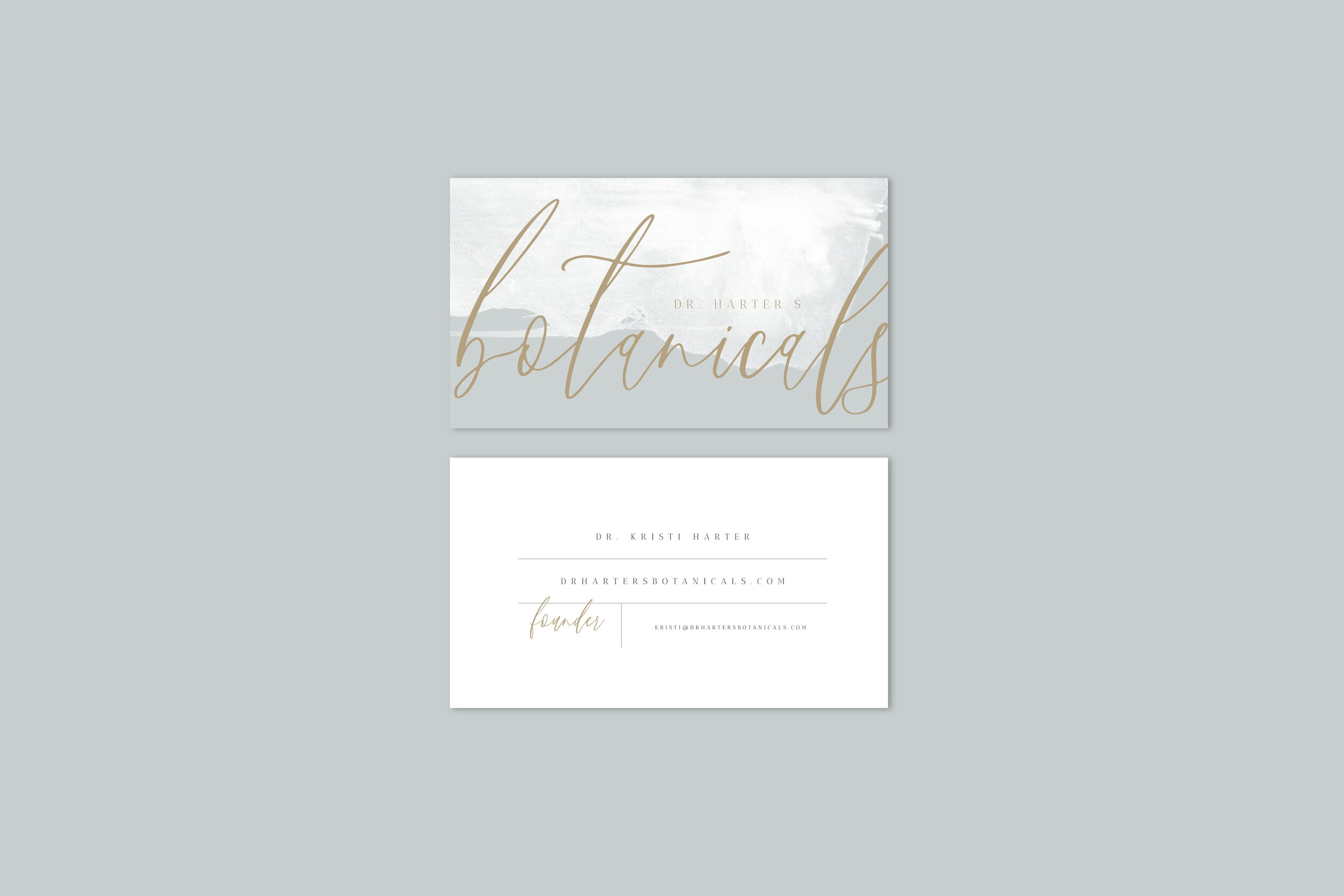
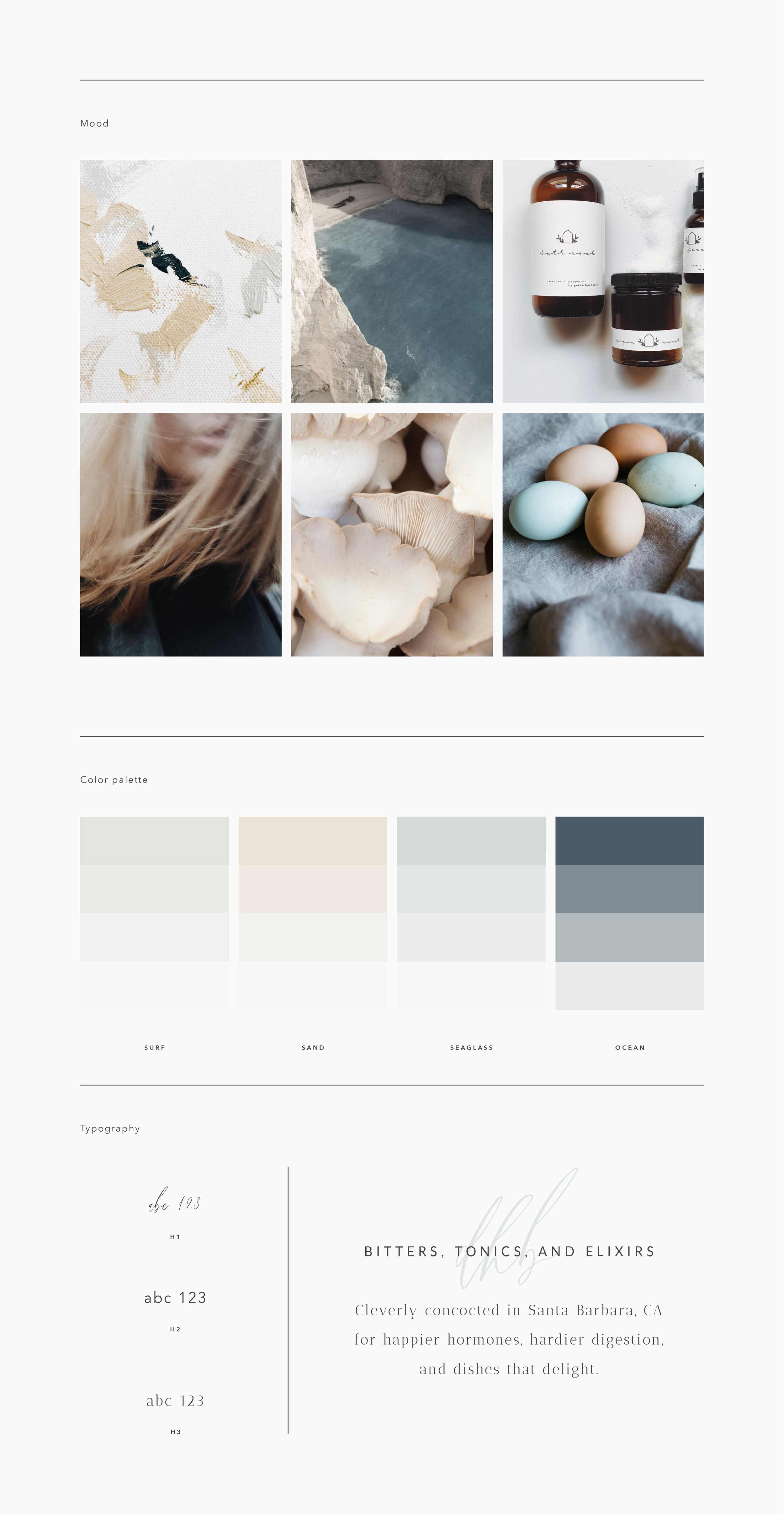
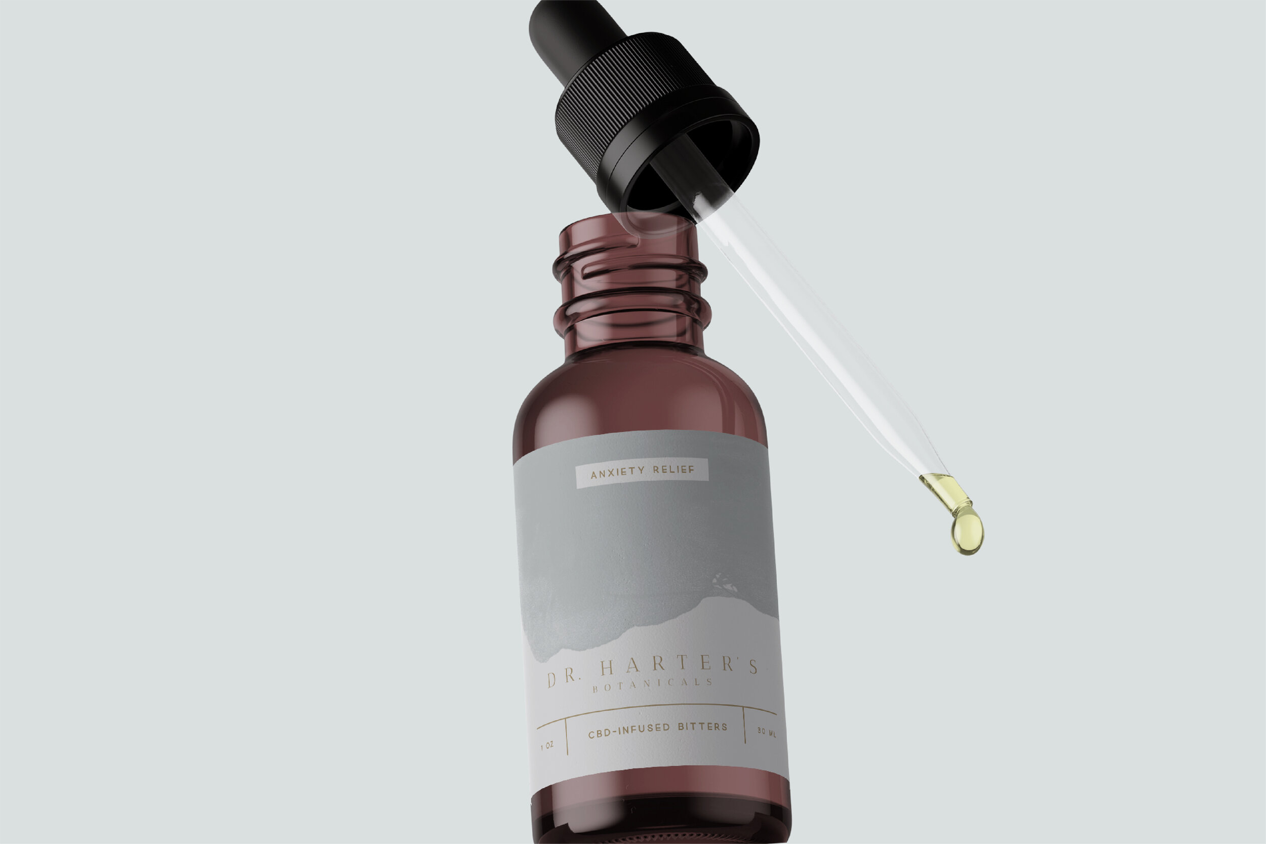
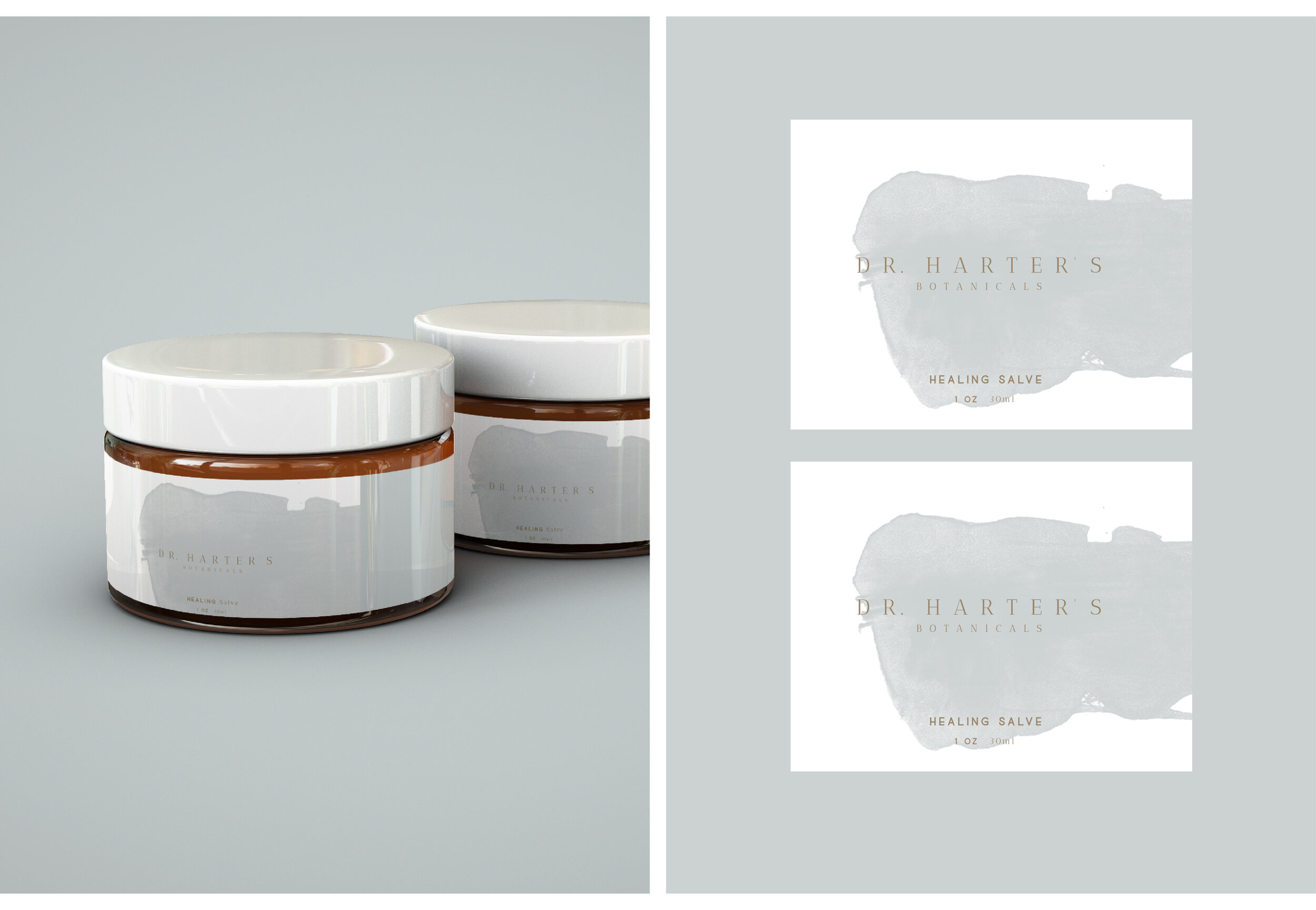
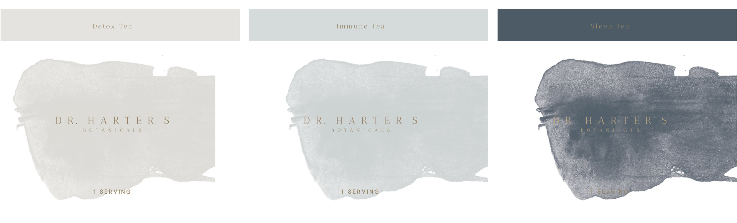
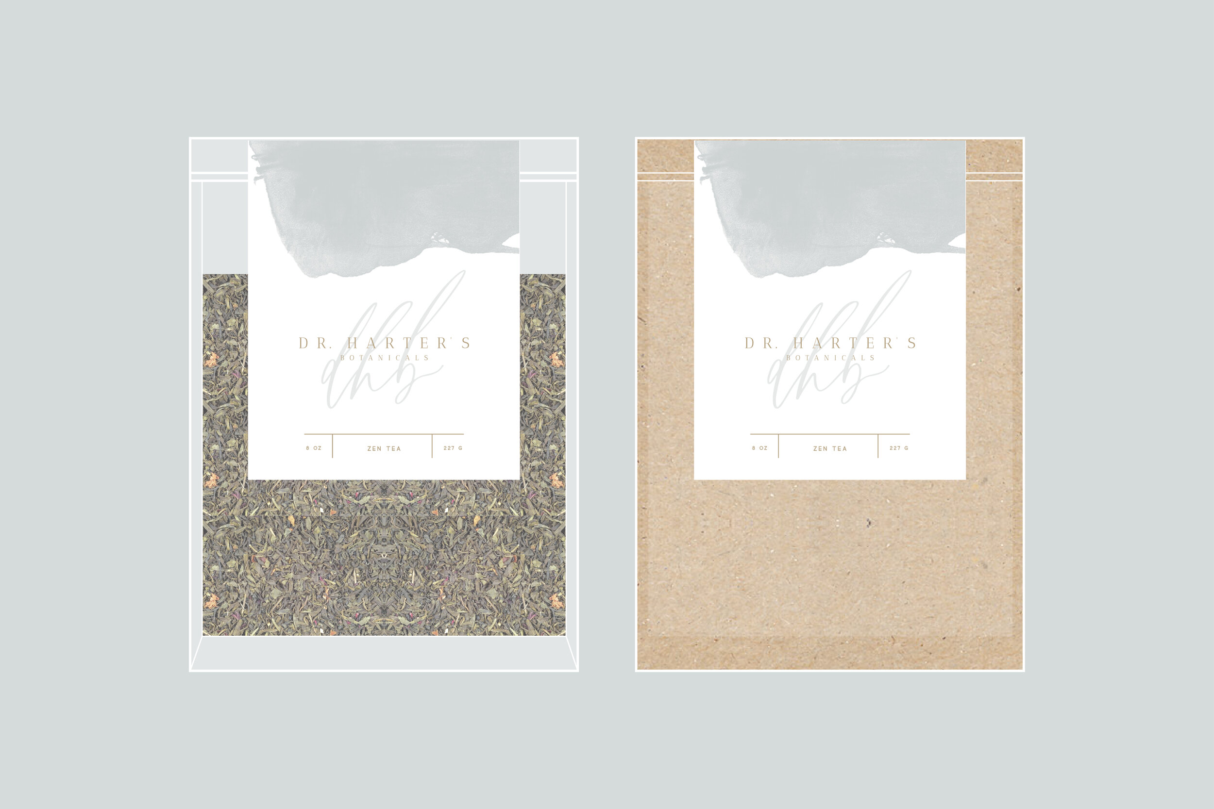
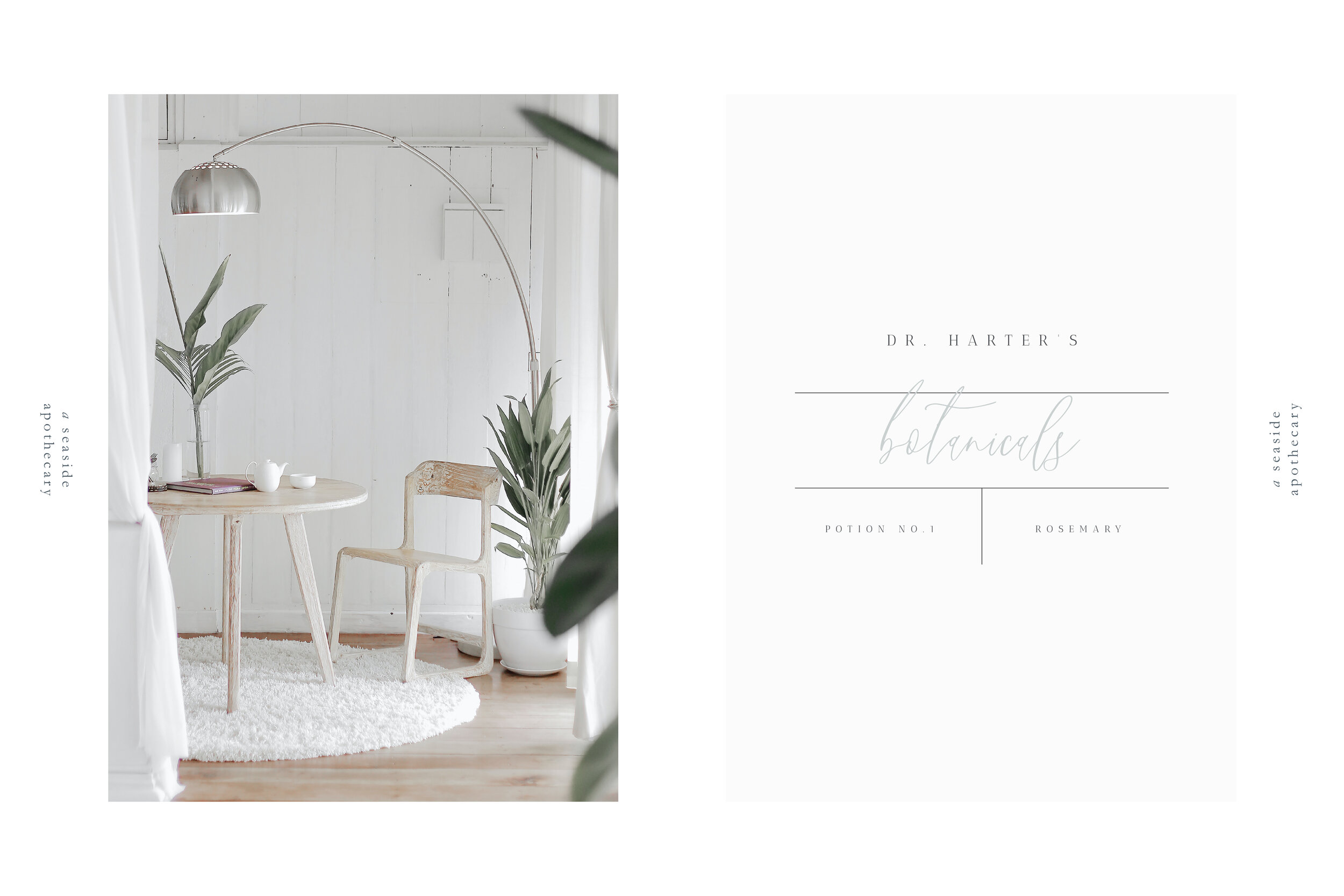
DR. HARTER’S BOTANICALS is a seaside apothecary offering bitters, teas, salves and elixirs cleverly concocted for happier hormones, hardier digestion, and dishes that delight.
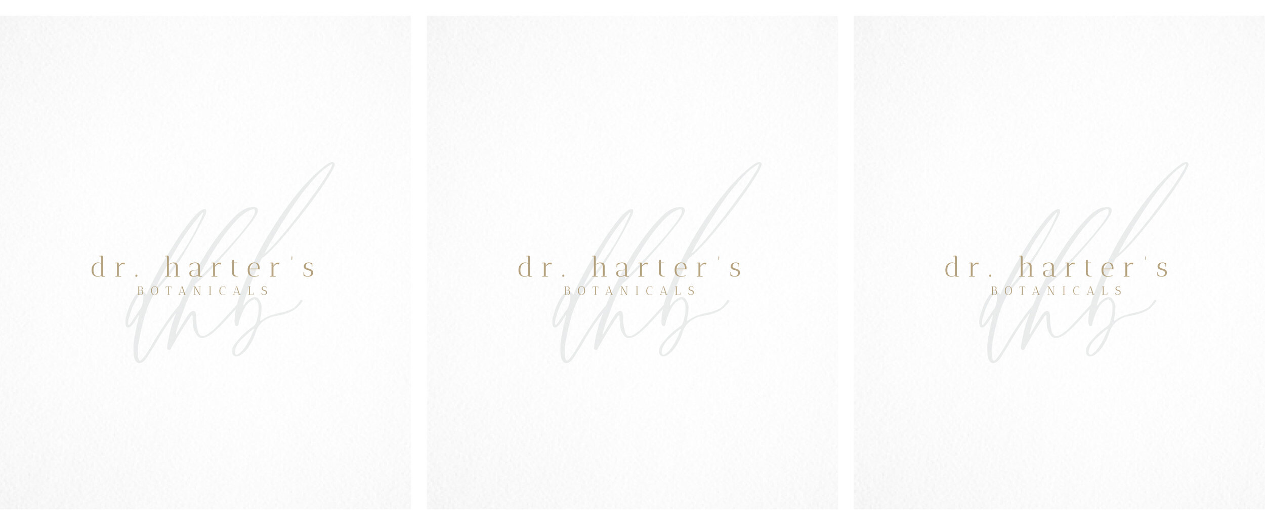
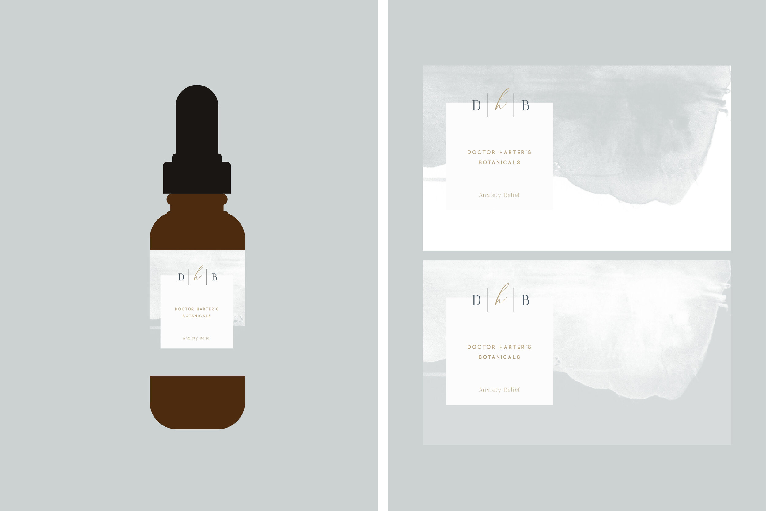
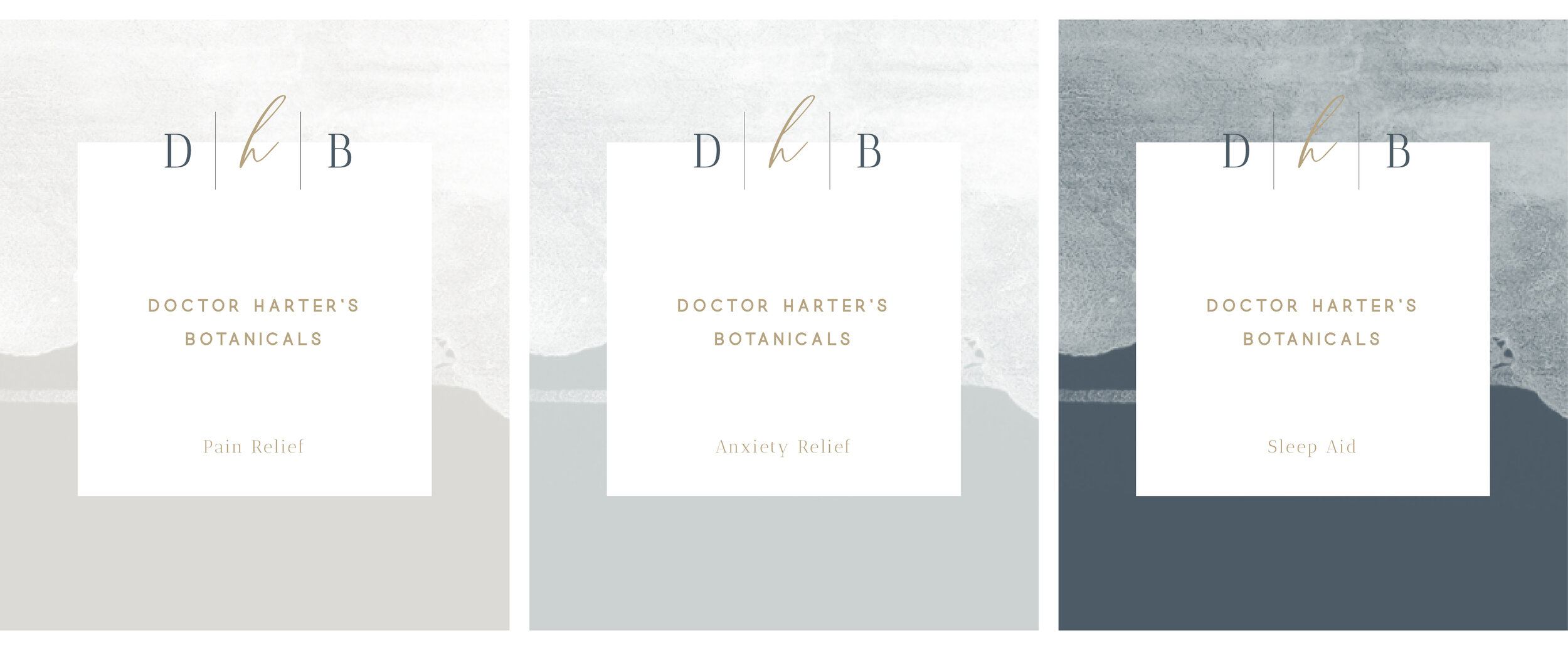
To visually communicate the brand’s location by the water, Canopy layered watercolor strokes beneath key information, mimicking waves crashing and receding against the shore. This design device is accented by vertical + horizontal lines, alongside a script font, reminiscent of a doctor’s prescription pad, communicating the founder’s experience as a clinician. Finally, gold foil is applied to packaging and other paper assets to give the brand’s identity an elegant, elevated touch.
www.drhartersbotanicals.com - COMING SOON
Services
Brand Strategy, Brand Styling, Logo Design, Identity Design, Packaging Design
